



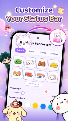
I installed Emoji Battery Widget & Icons because I wanted a phone that felt a little more personal without replacing the entire launcher or spending an afternoon adjusting dozens of settings. The idea is simple: make battery information more expressive, add a small decorative touch to the home screen, and give charging time a bit more visual character. In practice, the app sits between practical status information and lighthearted phone decoration.
That balance is what makes it interesting. This is not a full theme engine, a productivity dashboard, or a serious battery-management tool. It belongs in the personalization category, and its appeal comes from changing the way a familiar phone detail looks rather than changing how the phone works. I found it most useful when I treated it as a small visual layer over my existing setup instead of expecting it to redesign Android for me.
From a plain battery indicator to a more personal phone routine
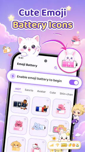
The starting condition is familiar: the standard battery icon does its job, but it is easy to overlook, and the home screen can feel identical to everyone else’s. That is where this app makes sense. Its central concept is an emoji-based battery display, supported by screen pets and charging effects. Those elements give the phone a more playful identity while keeping the main purpose easy to understand.
I also like that the concept does not demand a complete change of habits. You can continue using the phone, the usual notification shade, and your preferred home-screen arrangement. The app is aimed at people who want a visible change with relatively little commitment. If you enjoy cute interfaces, expressive icons, or small animated touches, it has a clearer reason to exist than a generic wallpaper application.
The developer is Tools for Everyday - AI Tasks, and the app is free to install. Optional purchases range from a few dollars to amounts approaching twenty dollars per item, so I would approach the extra content carefully rather than assuming every decorative option is included. The free starting point is useful because it lets you decide whether the visual style fits your phone before paying for anything.
Its audience is broad enough to include younger users and families, helped by an Everyone content rating. At the same time, the design is not limited to children. A restrained emoji choice or a small companion can look pleasant on a minimalist home screen, while brighter effects suit someone who wants the phone to feel more animated. The important distinction is taste: this is personalization with personality, not invisible utility.
What I would prepare before setting it up
Before opening the app, I would decide what I actually want to change. There are three separate goals here: making the battery status more noticeable, adding a decorative screen pet, and making charging feel more engaging. Trying to use every element at once can make the home screen feel busy, especially if you already have several widgets, calendar blocks, or music controls competing for space.
My preferred starting point would be the battery element alone. It is the most practical part of the concept because it connects decoration with information. Once that feels comfortable, I would add a pet or charging effect one at a time. This staged approach makes it easier to identify which part improves the experience and which part merely adds visual noise.
There is also a useful distinction between the lock screen, home screen, and charging moment. A decorative feature that looks charming while the phone is plugged in may be distracting when you are checking the battery quickly during a commute. I would therefore judge each element by when I see it, not only by how attractive it looks in a setup preview.
The setup flow and the first handoff
The first handoff is from the app’s own controls to the phone’s everyday interface. That matters because a personalization app is only successful if its output remains useful after you leave the app. I would start by choosing an emoji battery style that is readable at a glance. A highly expressive design is less helpful if I need to stop and interpret it every time I check the remaining charge.
After selecting the visual treatment, the next step is placing it where I naturally look. A home-screen widget belongs in a different space from an icon or a charging animation. I would keep the battery element near the top or in the first home-screen panel, while placing decorative content away from essential shortcuts. This is one of the app’s less obvious decisions: the best layout is determined by your checking habit, not by the most attractive preview.
On Android, the result of a personalization app can also depend on the phone’s own home-screen behavior. Widget spacing, icon grids, animation handling, and manufacturer-specific design choices may affect how polished the final arrangement feels. That is not a reason to avoid the app, but it does mean the installation is not the entire workflow. The handoff to the launcher is where the visual idea becomes part of your real routine.
The app supports Android 8.0 and later, which keeps it accessible to people using older supported phones as well as newer devices. I would still judge the experience on the actual phone rather than assuming every screen will look identical. A compact display may need a simpler arrangement, while a larger screen can accommodate the battery treatment and a companion without crowding.
Building a useful home-screen arrangement
Once the battery display is in place, I would test it during three ordinary moments: unlocking the phone in a hurry, checking the charge before leaving, and glancing at the screen while multitasking. These situations reveal more than a static setup screen. If the emoji treatment is instantly understandable in all three, it is doing practical work. If it only looks good when I stop to admire it, it is functioning mainly as decoration.
A good workflow also leaves room for important information. I would avoid placing the widget directly beside a dense weather panel or a row of frequently used shortcuts. The goal is not to fill empty space; it is to create a visual signal that remains easy to read. This is especially useful for people who like themed home screens but still want their primary screen to stay efficient.
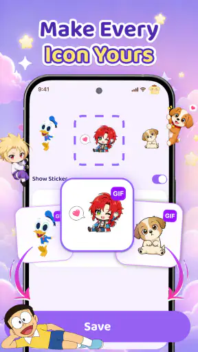
The screen-pet idea introduces a different handoff. Instead of delivering information, it delivers atmosphere. I would place that element where it can be enjoyed without covering controls or making the screen feel like a game interface. For some users, that small character can make the phone feel friendlier. For others, it may be the first thing they remove. The app works best when it lets the decorative layer support the phone rather than dominate it.
One practical tip is to create a “quiet” first screen and use a more expressive arrangement on a secondary page. That gives you a fast route to battery information while preserving a space for the pet or other visual elements. It is a better compromise than forcing every feature into the same area. It also makes the app more suitable for someone who likes personalization at home but wants a clean display at work.
Charging as the second workflow
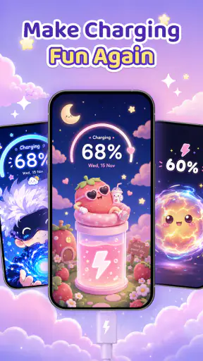
The charging effect changes the timing of the experience. A widget is something I consult; a charging animation is something I encounter when I connect the cable or place the phone on a charger. That makes it a small moment of feedback rather than a permanent interface element. I found this distinction important because it explains why the effect can feel enjoyable even when the rest of the home screen remains restrained.
My realistic everyday scenario would be arriving home with a low battery, connecting the phone while making dinner, and seeing the charging presentation confirm that the routine has started. The app does not make the phone charge faster, but it can make the transition from low power to charging feel more deliberate. In a similar way, someone working at a desk might use the effect as a visual cue that the phone has been connected properly.
The trade-off is that animated feedback is not automatically better feedback. If you often plug in your phone in quiet settings, prefer immediate information, or dislike decorative interruptions, the effect may feel unnecessary. I would keep the charging presentation subtle if possible and disable or reduce it when it competes with the simple act of checking whether the cable is connected.
Another useful habit is to evaluate charging effects over several days rather than deciding from the first launch. Novelty can make any animation feel impressive for a short time. The real test is whether it remains pleasant after you have seen it repeatedly. This is where the app’s personalization value becomes personal in the literal sense: one user’s welcome touch can be another user’s recurring interruption.
How the pieces hand off to one another
The strongest complete workflow is not “open the app and admire the options.” It is input, arrangement, daily glance, and occasional charging feedback. I choose a battery style, place it where I naturally check the screen, add a decorative element only if it leaves the layout clear, and then observe how the phone feels during normal use. Each stage hands something to the next one.
The battery display hands information to the home screen. The home screen hands that information to the user during a quick glance. The charging effect hands a moment of visual confirmation to the charging routine. The screen pet hands personality to the otherwise functional interface. Thinking in these terms helps prevent a common mistake: judging every feature by the same standard. The battery element should be readable, the pet should be unobtrusive, and the charging effect should be enjoyable without becoming a nuisance.
This also explains why I would not install it as a replacement for a full launcher or a comprehensive icon pack. Those tools usually focus on changing the whole visual system. This app is more selective. It adds a few recognizable points of character, which is better for someone who likes their current launcher and does not want to rebuild the phone from scratch.
Where it compares well with ordinary alternatives
The usual alternative is simply keeping the system battery icon and using a wallpaper or launcher theme for personality. That approach is cleaner and often more consistent, but it does not make battery status feel like part of the phone’s visual identity. Emoji Battery Widget & Icons offers a more direct connection between appearance and a daily piece of information.
A full customization launcher is more powerful if you want control over icon shapes, gestures, grids, folders, and transitions. It is also more work. I would choose a launcher when I want a complete redesign, but I would choose this app when the existing interface is mostly fine and I only want the battery and charging experience to feel different.
Static battery widgets are another comparison point. They can be clearer and more practical, particularly for someone who wants large text or detailed status information. The advantage here is emotional rather than technical: emojis and visual effects can make a routine check more inviting. The disadvantage is that decorative clarity may not match the precision of a conventional status widget.
For users who care primarily about battery health, charging speed, temperature, or long-term usage patterns, a dedicated battery utility is the better choice. This app’s value is presentation. I would not use it as my only tool for diagnosing unusual battery drain or making decisions about power management. It is a personalization layer, and expecting advanced battery analysis would lead to disappointment.
What I would watch for after installation
The first possible friction is visual overload. Emoji, a screen pet, a widget, and a charging effect can all be appealing separately. Together, they may compete for attention. My recommendation is to establish a visual hierarchy: let the battery status be the practical anchor, use the pet as a secondary accent, and treat charging effects as occasional feedback. If everything is equally bright or animated, the phone can feel less organized.
The second issue is the difference between a preview and the final home screen. The app can provide the design idea, but the launcher controls the surrounding space. Icons, folders, wallpaper contrast, and widget placement all influence the result. I would spend a few minutes checking the screen in daylight and in low light, because an arrangement that looks balanced in one condition may be harder to read in another.
The third consideration is cost. Since the app is free but includes optional purchases priced from $2.99 to $19.99 per item, I would not buy an extra simply because it is colorful or animated. I would first identify a specific gap in the free experience: perhaps a style that matches the rest of the phone or a visual treatment that is easier to read. That makes the purchase decision more deliberate and reduces the chance of paying for novelty that fades quickly.
I would also pay attention to how often I interact with the app after setup. Personalization tools can be enjoyable during the first session and then disappear from daily awareness. That is not necessarily a failure; if the final arrangement quietly improves the phone, the app has done its job. But if I keep reopening the app to search for a better look, that may indicate the result is not settled or that the available choices are encouraging endless tweaking.
Who gets the most from this app
I think it is a good fit for someone who finds standard Android visuals too plain but does not want a complete launcher replacement. It also suits users who enjoy emojis, small animated touches, and themed screens, especially when the goal is to make a personal device feel more cheerful. Families may appreciate the friendly style, while adults can use a restrained arrangement that adds character without turning the phone into a toy.
It is also useful for someone who checks battery status frequently but wants that information to feel more visible. A distinctive battery display can act as a gentle reminder before leaving home or starting a long trip. The benefit is strongest when the visual treatment remains legible and is placed on the first screen you actually use.
I would skip it if you want technical battery reports, a distraction-free interface, or a complete system-wide theme. I would also look elsewhere if you dislike animations, prefer monochrome design, or become frustrated by adjusting widgets and launcher layouts. In those cases, the standard battery indicator or a straightforward utility widget is likely to be faster and more appropriate.
My result after using the full flow
The outcome is modest but clear: the phone feels more deliberately arranged, and battery checking becomes a little more noticeable. The app does not transform Android, nor should it be judged as though it were trying to. Its success comes from connecting a practical status indicator with a playful visual language, then extending that language into the home screen and charging routine.
Its current version is 1.0.4, and the app has already reached over a million installs with a 4.4 average from around fifty-seven thousand ratings. Those figures suggest that the concept has broad appeal, but they do not remove the need to test the style against your own habits. Personalization is unusually subjective: a popular look can still be wrong for a minimalist phone, and a simple emoji battery can be exactly right for someone who wants a small daily lift.
My honest recommendation is to begin with one change, keep the layout readable, and give the result enough time to prove that it belongs in your routine. Use the battery element for clarity, the pet for personality, and the charging effect only if it improves that particular moment. With that approach, the app feels considered rather than cluttered.
For a free personalization app, it offers a pleasant middle ground between doing nothing and rebuilding the entire phone. I would recommend it to friends who want a friendly visual upgrade and are comfortable making a few home-screen adjustments. I would not recommend it to anyone seeking battery diagnostics or a fully controlled theme system. In the right situation, Emoji Battery Widget & Icons turns an ordinary battery check into a small piece of self-expression without asking you to give up the phone setup you already know.


